


Tel: 943.080.200 | Mail: info@expochess.org
IDIOMAS:
![]()
![]()
"Life is like a game of Chess"
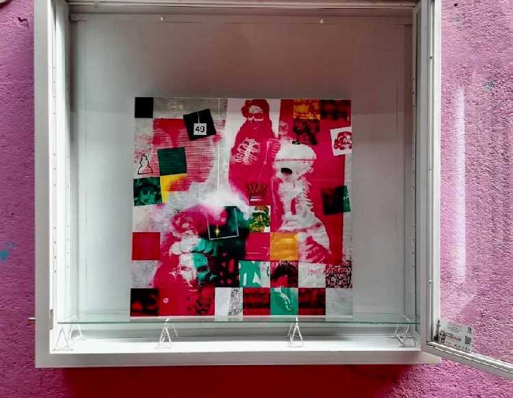
HILDAKOEN CHESS (Chess of the Dead), the work of the Basque painter Mikel Garate, is already exhibited at the UAM Xochimilco of CDMX, Mexico!
-Mikel: "In this painting, the subject of chess and the Day of the Dead is poetically united, it is an exercise of association of images from the field of archeology in Mexico (skull of Teotihuacan culture, Mayan priest, skull mexica ...) , Roman horse in bronze, parts of sculptures by Michelangelo and Verrocchio, the apostles of Oteiza as chess pawns, contemporary photographs (head of the famous boxer Urtáin, skeleton used for teaching, children characterized / made up for the Day of the Dead, skulls for sale in street vendors ...), symbols / pieces of chess, memories of life, etc. Many of the elements used have a narrative character, but there are also some with a very large symbolic charge, and employees in a way that the descriptive can become iconic, and vice versa, in large part it depends on the viewer's gaze.
The geometry of the composition reminds the chessboard, especially in the lower part, and as it rises it fades away leaving the main stage to relations of images and tensions organized in another direction. On the golden ratio we can find a light / flame, contained within a square / drawer, painted in silver, which symbolizes life beyond the physical vehicle or body, and is also related to chess, when the pawn reaches the last box and there is a transmutation of it, or when the game is over and all the pieces returns to the box in an intervention of equality for all, as does death (not free of poetry) with human beings.
In terms of color the dominant ones are variations of white, greenish shooting to emerald, and reddish shooting to pink. This may be reminiscent of the colors of the Mexican flag, but also those of the Ikurriña or Euskadi flag. The use of them seeks the possible combinations generating a great variety of nuances, using them both opaque or through glazes. To take into account also that the complementary color of red is green, so its mixture gives us the dark ones. The limitation of the chromatic palette conjugates well with the proliferation of images that it possesses, a greater variety would have repercutido in an excessively variegated and strident result. The abundance of images harmonizes well with the simplicity of the range of colors.
In the end, as the author usually does, a beautiful harmony of colors and forms is generated, with a large subjective background, where the observer finishes closing the reading of the work. "
 Facebook
 Google PLus
 Twitter